

Many professionals face a frustrating cycle: spending nights crafting a PPT, only to receive silence or wandering eyes during the presentation. The root of this failure lies not in poor design, but in confusing two distinct media: "presentations" and "documents." Projecting detailed text reports forces the audience into a doomed cognitive battle between reading the screen and listening to the speaker. The brain cannot process visual text and auditory speech simultaneously with high quality; this "cognitive load" is the invisible killer of presentations. A true presentation acts as a visual billboard for ideas, not a projected Word document; the former relies on spatial logic and visual impact (the "3-second rule"), while the latter follows linear logic suited for deep reading. Failing to distinguish between the two creates a "slideument"—a hybrid that fails both as a standalone report and as a live visual aid. Separating these functions is key to efficiency and professionalism. Only when your PPT embraces minimalism and stops acting as a teleprompter can your voice take center stage, shifting audience attention from reading to resonating with your core points.
Core Misconception: Are You "Presenting" or "Writing a Document"?
For many professionals, the most fundamental error when creating a PPT lies not in ugly layouts or stiff animations, but in confusing the essential attributes of a "Presentation" and a "Document."
When we dump massive amounts of text, complex logical deductions, and detailed data tables directly onto slides, we create neither an efficient document nor a brilliant presentation, but what communication expert Nancy Duarte calls a "Slideument" (Slideument)—a monstrosity that tries to be both but succeeds at neither.
Core Definition: The Cognitive Battle Between Reading and Viewing
To solve the problem of "no one watching," we must first clarify the underlying logical differences between these two media:
- Documents are meant to be "read": They require high information density, logic must be self-consistent within the text, and readers can re-read and think at their own pace. Amazon CEO Jeff Bezos banned the use of PPTs in meetings, requiring executives to write 6-page narrative memos instead, precisely because the narrative structure of a document forces the author to clarify complex thoughts, making it suitable for deep reading.
- Presentations are meant to be "viewed": They are visual aids for the speaker. The information density of a presentation must be extremely low because its function is not to convey full information, but to reinforce the speaker's core points through visual impact.
"Cognitive Load" is the key to understanding this misconception. The human brain cannot process the tasks of "reading complex text on a screen" and "listening to the speaker's stream of speech" simultaneously with high quality. When your PPT is filled with text like a document, the audience's attention is forced to switch repeatedly between "reading" and "listening," eventually leading to cognitive overload—they either choose to read without listening, listen without looking, or simply stop paying attention altogether.
Key Differences Comparison Table
To thoroughly distinguish between the two, please refer to the essential differences in the following three dimensions. Before you start creating your next PPT, please check against this table:
Dimension | Document | Presentation |
|---|---|---|
Core Medium | Text-centric: Relies on linear logic (sentences, paragraphs) to carry information. | Visual-centric: Relies on spatial logic (charts, whitespace, contrast) to reinforce key points. |
Interaction Mode | Passive/Independent: The reader holds control, can review or pause at any time, and can understand without external assistance. | Active/Assistive: The speaker holds control, the audience follows the rhythm of the speech, and it is often difficult to understand the full picture without the speaker. |
Consumption Speed | Slow Deep Reading: Suitable for complex content requiring more than 10 minutes of deep thinking. | Instant Scanning: Single-page content should be captured and understood by the audience's visual system within 3 seconds. |
Once you understand this distinction, you will realize why those PPTs with "font size 12, line spacing 1.0" are actually forcing the audience to take an impossible reading comprehension exam. A true presentation should be a billboard for the speaker's thoughts, not an instruction manual.
Why "Moving Word into PPT" is a Workplace Taboo
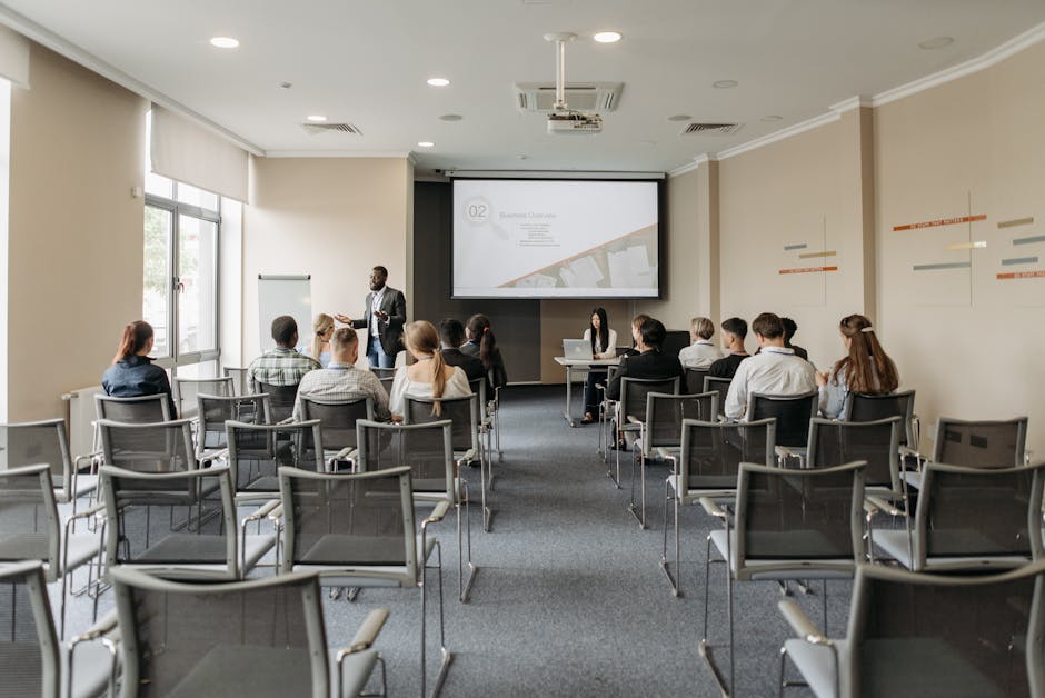
In workplace reporting, the most common and fatal mistake is treating PowerPoint as a "projected version" of Word. This practice is not only aesthetic laziness but also a serious failure in communication strategy. When a presentation becomes a "document display," you are essentially forcing the audience to make a painful choice between "listening to you speak" and "reading what you wrote."
1. Cognitive Load and the Zero-Sum Game of Attention
Many speakers believe that putting detailed text on a PPT is a sign of "comprehensive information," or a way to prevent themselves from forgetting lines. However, scientific research shows that the human brain cannot process the tasks of "reading text" and "listening to language" with high quality simultaneously, because they both compete for the language processing center in the brain.
When large blocks of text appear on the screen, the audience instinctively starts reading. Since reading speed (approx. 250-300 words/minute) is much faster than speaking speed (approx. 150 words/minute), the audience will "finish reading" your core points within the first few seconds of you speaking, and then fall into bored waiting; or, they will completely block out your voice in order to finish reading complex, long sentences.
The result is devastating: Your PPT steals the attention that should belong to you, and you become background noise to your own PPT.
2. The Self-Devaluation of the Speaker's Value
If the content on the PPT can independently explain everything, then the speaker's existence becomes superfluous. This phenomenon is called the misuse of "Slidedoc" by Nancy Duarte—Slidedocs are intended for silent reading, not for live presentations.
When you read along with a screen full of text (Read-along), the subtext you convey to the audience is: "I don't have the ability to digest and refine information; I am just a reading machine." This directly weakens your professional authority (Authoritativeness), making upper management feel that this meeting could have been resolved with a single email.
3. Practical Scenario: From "Document Thinking" to "Presentation Thinking"
To intuitively understand this difference, we can compare the presentation effects of the same reporting topic under two different mindsets:
Scenario: Quarterly Marketing Review
Dimension | ❌ Document Thinking (The "Document" Approach) | ✅ Presentation Thinking (The "Presentation" Approach) |
|---|---|---|
Visual Content | Title is "Q3 Marketing Problem Analysis," listing 5 bullet points below, each followed by 3 lines of detailed explanation, including specific data, cause analysis, and follow-up measures, totaling over 150 words. | Title is "Conversion Rate is the Core Bottleneck," screen center only displays a striking red data point "-15%", accompanied by a highlighted broken section of a funnel chart. |
Speaker Behavior | Standing sideways looking at the screen, reading out the bullet points word for word, or using a laser pointer to circle densely packed text. | Facing the audience, pointing at the data on the screen saying: "Everyone please look at this -15%, this is the root cause of us missing targets this quarter. Next, I will explain why this happened..." |
Audience Reaction | Quickly scanning the text, starting to look down at phones or thinking about what to eat for lunch, feeling the speaker is wasting time. | Eyes focused on that striking red data, ears pricked up to listen to the speaker explain the story and logic behind it. |
Result | Information Overload: Audience remembers no key points, only remembers "lots of words." | Emotional Resonance: Audience remembers the crisis sense of "plummeting conversion rate" and has expectations for the solution. |
Just as Amazon founder Jeff Bezos implemented in meeting culture, if information must be presented in high-density text, the correct approach is to write a 6-page narrative memo and read it silently at the start of the meeting, rather than making a text-filled PPT. The workplace taboo lies not in using text, but in attempting to use a presentation tool to carry document functions, ultimately leading to failure on both fronts.
Dimensional Comparison: Essential Differences from Structure to Usage

Many professionals are accustomed to viewing PowerPoint as a "horizontal version" of Microsoft Word, believing they just need to copy-paste text and increase the font size. However, this approach ignores the fundamental divergence between the two in terms of information architecture and cognitive logic. To thoroughly solve the problem of "no one watching," one must perform a surgical analysis from three dimensions: Information Hierarchy, Context, and Information Density.
1. Logical Construction: Linear Narrative vs. Spatial Logic
Documents follow linear logic. Readers acquire information from top to bottom through the order of sentences, paragraphs, and chapters. Their coherence relies on the transitions of the text, allowing readers to control the reading pace and reread at any time. Just like the Six-Pager model promoted by Amazon, the goal of a document is to provide a complete, independent argument, allowing readers to digest complex causal relationships through deep reading in silence.
Presentations follow spatial logic. The audience's line of sight is controlled by layout, font size, color contrast, and animation guidance.
- Visual First: Slides must use Layout to instantly convey core points, rather than relying on grammatical conjunctions.
- Instant Cognition: In a presentation scenario, the audience has no opportunity to "reread." If a page requires the audience to scan line by line from left to right like reading a book, it destroys the immediacy of the presentation and leads to cognitive overload.
2. Context Dependence: Stand-alone vs. Speaker Symbiosis
The simplest way to judge whether a file is a "document" or a "presentation" is to perform the "Mute Test":
- Documents must be Stand-alone: If the file is emailed to someone who did not attend the meeting, can they fully understand all details without any narration? If so, this is a qualified document or Slidedoc.
- Presentations must rely on the speaker: Excellent presentations should appear "incomplete" without the speaker. It is merely the speaker's backdrop, emotional amplifier, or data corroboration. If the audience can get 100% of the information just by looking at the slides, then the speaker's existence is superfluous—you might as well just send the file to them to read themselves.
3. Decision Matrix: The Game of 3 Seconds vs. 10 Minutes
To help you clarify your goals before production, please refer to the following decision matrix. This is the hard standard for distinguishing between "visual aids" and "reading materials":
Dimension | Presentation | Reading Document (Document / Slidedoc) |
|---|---|---|
Consumption Time | 3-Second Rule: The audience should understand the gist of the page within 3 seconds, then turn attention back to the speaker. | 10-Minute Rule: Readers need dedicated time for silent reading, thinking, and annotation. |
Information Density | Low Density: One idea per slide. | High Density: Includes exhaustive data sources, footnotes, complete sentences/paragraphs, and argumentation processes. |
Font Size | Large Font: Usually larger than 24pt, ensuring visibility for the back row. | Small Font: Usually 10-12pt, suitable for close-range screen reading or printing. |
Audience State | Passive Following: The audience follows the speaker's pace and cannot skip ahead. | Active Control: The audience decides the reading speed and focus points themselves. |
Applicable Scenarios | Investment roadshows, year-end performance reporting, large-scale launch events. | Due diligence reports, detailed technical proposals, pre-read materials before meetings. |
Expert Tip: The most common mistake in the workplace is attempting to satisfy both of the above needs with a single file. This results in a "hybrid monster": too dense for a presentation, yet not rigorous enough for a document. The efficient strategy is separate production: use Word or high-density PPT (Slidedoc) to write detailed reports for circulation after the meeting, while using another minimalist visual PPT for the live presentation.
Special Scenario: The Positioning of Slidedocs (Reading-Oriented PPTs)
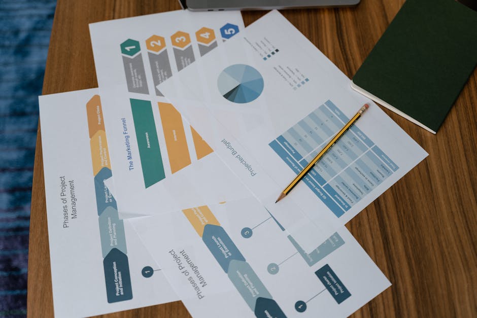
In the pursuit of the "less is more" presentation aesthetic, professionals often face an awkward reality: bosses or clients ask, "Send me the PPT to look at." If your PPT contains only exquisite images and scattered keywords, the document loses its value once detached from your speech.
Here we need to introduce a key concept popularized by presentation expert Nancy Duarte: Slidedoc (Reading-Oriented PPT).
What is a Slidedoc?
A Slidedoc is a hybrid between a "visual presentation" and a "text document." It utilizes the layout advantages of PowerPoint software (more flexible combinations of text and images than Word) to carry high-density information similar to a Word document.
- Essence: It is a Document created within PowerPoint software.
- Characteristics: High text density, coherent logic; readers can fully understand it without the speaker's explanation.
Reasonable Application Scenarios in the Workplace
Although a "wall of text" is a taboo in presentations, creating a Slidedoc is not only acceptable but often the most efficient choice in the following scenarios:
- Pre-read: In high-performance companies like Amazon, detailed materials are distributed for silent reading before meetings begin. At this time, you need a rigorously logical Slidedoc, not confusing "images with captions."
- Archival Reports: Project closing reports or quarterly analyses; these documents need to be archived and retrieved in the future. Since no speaker is present, the content must be detailed and self-explanatory.
- Standalone Tutorials: Operation manuals or process guides usually require screenshots combined with detailed step-by-step instructions. The page container of PPT is more suitable for this step-by-step presentation than flow documents.
Core Principle: Distinguishing Between "Tool" and "Medium"
The root cause of PPTs being ignored or criticized lies in confusing the Tool with the Medium.
- Tool: PowerPoint, Keynote, or WPS Presentation.
- Medium: You can use these tools to create "visual aids for speeches (Presentation)" or "e-books for reading (Slidedoc)."
A fatal error in practice is projecting a Slidedoc onto a big screen. Once you use a text-heavy "reading document" for a live presentation, the audience will immediately fall into "reading mode." Their reading speed is much faster than your speaking speed, resulting in no one listening to what you are saying.
Expert Advice: If your report requires both a live presentation and subsequent archiving, do not attempt to solve all problems with a single PPT.
* Approach A: Create a Slidedoc to distribute as a handout to the audience, and project only minimalist visual pages during the presentation.
* Approach B: Use the "Notes" function in PPT to place detailed text in the notes section and export it as a document, keeping only visual anchors on the screen.
Technical Literacy: The Differences Between PPT, PPTX, and Presentations
Before diving into how to create excellent presentations, we must first clarify several technical concepts that are often confused. Many misunderstandings in workplace communication often stem from vague definitions of tools—when the "PPT" you mention and the "presentation" the other party understands differ in format or usage, it not only lowers communication efficiency but may also lead to a compatibility disaster for files at critical moments.
1. Concept Clarification: Presentation, Slide, and PPT
In daily speech, we are accustomed to using "PPT" to refer to everything, but in a professional context, these three words represent completely different levels:
- Presentation: Refers to the entire delivery process or collection of the project. It not only includes visual files but also implies the speaker's logic, Script, and on-site interaction design.
- Slide: The single-page visual that makes up the presentation.
- PPT (File Format): Strictly speaking, it only refers to the specific file extension (.ppt) used by PowerPoint software in version 2003 and earlier.
2. Core Technical Differences: .ppt vs .pptx
Many users habitually ignore the suffix when saving files, or believe there is no difference between the two. In fact, Microsoft carried out a thorough overhaul of the underlying architecture in the Office 2007 version, causing these two formats to be fundamentally different.
- Old Version .ppt (Binary): This was the default format during the 1997-2003 period. It is based on a Binary structure, packaging all text, images, and audio into a single, closed file. This structure leads to bloated file sizes, and once the file is corrupted, data is extremely difficult to recover.
- New Version .pptx (XML): This is the industry standard from version 2007 to the present. The "x" stands for XML (Extensible Markup Language). Essentially, a .pptx file is actually a compressed archive; if you change its suffix to
.zipand unzip it, you will find a folder structure containing images, media, and XML code inside. This open architecture makes file sizes smaller and fault tolerance higher.
3. Performance Comparison Cheat Sheet
To make the right choice in practice, here is a comparison of the two formats across key dimensions:
Dimension | .ppt (Old Format) | .pptx (Modern Format) | Practical Impact |
|---|---|---|---|
Underlying Architecture | Binary | XML + ZIP Compression Technology | .pptx data management is more efficient and less prone to crashing. |
File Size | Larger | Smaller (Usually reduced by 50%-75%) | Utilizing ZIP compression technology, .pptx is more suitable for email transmission and cloud collaboration. |
Security | Lower | Higher | .pptx does not contain macro code by default (macros need to be saved as .pptm), effectively isolating potential macro virus risks. |
Feature Support | Basic functions only | Supports all modern functions | When saving in .ppt format, features like Morph, 3D models, and embedded HD video will be lost or become invalid. |
Compatibility | Dedicated to extremely old systems | Universal for mainstream devices | Unless the client explicitly requests a version below Office 2003, there is no reason to use .ppt. |
4. Guide to Avoiding Pitfalls
In the current workplace environment, it is strongly recommended to always use the .pptx format.
Since the .ppt format has limited support for modern graphics rendering engines, when you save a carefully designed .pptx file as .ppt, "format degradation" often occurs: originally transparent image backgrounds turn black, smart charts become uneditable images, and complex animation paths disappear. This is not just an aesthetic issue, but a matter of professionalism—do not let outdated file formats become an invisible bomb at your presentation venue.
Practical Advice: How to Choose and Convert Correctly
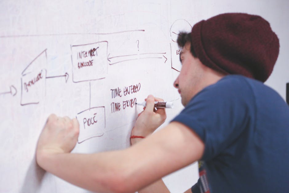
The biggest misconception many people have when making PPTs is conflating the "thinking process" with the "creation process." When you open PowerPoint and stare blankly at a blank slide, or repeatedly revise wording in a text box, you are actually using a layout tool for logical creation—this is not only inefficient but also makes it easy to fall into the trap of trivial details like alignment and fonts.
To fundamentally solve the problem of "no one reading the PPT," you need to restructure your workflow and strictly distinguish between the usage scenarios of "document mindset" and "presentation mindset."
1. The Golden Workflow: Document First, Slides Second
Efficient presentation creation never starts with PowerPoint. Please follow this "three-step" strategy:
- Logic Construction Phase (Word/Notion/Whiteboard):
Before opening PPT software, use word processing software (such as Word or various note-taking tools) to write a full script or detailed outline. At this stage, completely ignore layout and focus only on logic flow, arguments, and storylines. If your logic is not self-consistent in a Word document, making it into a PPT will only amplify the chaos. - Visual Transformation Phase (PowerPoint/Keynote):
Only open PPT after the document is finalized. At this point, your task is no longer "writing content," but "translating"—"translating" the core points from the document into visual anchors (charts, keywords, images). - Content Separation Phase:
This is the most critical step. Review your original document and divide the content into two parts:
- Core Conclusions → Put onto the PPT slide as visual guides.
- Supporting Details/Data Tables/Full Text → Move to "Speaker Notes" or create a separate Handout.
This "document-driven" workflow has also been validated in modern tools. For example, the core logic of tools like Powerdrill AI requires users to first upload detailed Word reports or papers, and then AI extracts key points to generate slides. This conversely proves that: High-quality PPTs are inevitably born from a solid document foundation.
2. Practical Techniques to Save "Crowded Pages"
When you find a PPT slide has too much text and you are reluctant to delete it, please use the "Speaker Notes Displacement Method."
Nancy Duarte once proposed the concept of Slidedoc, pointing out that presentation decks (for projection) and leave-behind documents (for reading) should be two separate files. However, in high-pressure workplace environments, we often don't have time to make two versions. A practical compromise solution is:
- On Screen (Presentation Layer): Keep only one powerful headline and one supporting chart/image. The audience only needs to understand "what happened" or "what the conclusion is."
- In Notes (Document Layer): Cut all the large blocks of text, data sources, and deduction processes originally piled up on the page and paste them into the "Speaker Notes" section at the bottom of PowerPoint.
- Post-Meeting Distribution: When exporting the PPT, select the PDF format "including notes," or use the link sharing function of collaboration tools like WPS Online/Tencent Docs to allow listeners who need to delve into details to read on their own after the meeting.
3. The Golden Rule of Decision Making: Use the Right Tool for the Right Job
To avoid wasting time on the wrong tools, please remember this simple golden rule of decision making:
Your Goal | Content Characteristics | Recommended Tool | Deliverable Format |
|---|---|---|---|
Persuade, Inspire, Showcase Ideas | Core points, visual impact, emotional connection | PowerPoint / Keynote | Live presentation + Minimalist slides |
Report Progress, Analyze Data, Archive | Complex logic, massive data, requires reading | Word / Excel / Slidedoc | Printed document or Projected reading-style PPT |
Team Collaboration, Multi-version Revision | Fragmented information, instant feedback | Online Collaborative Docs | Web link |
Summary: Do not attempt to use PPT to perform the functions of Word. If you find yourself writing short essays in PPT, please stop immediately and open Word; you are actually writing a document, not creating a presentation.